library(tidyverse)     # data wrangling and visualization
library(knitr)         # format output
library(rstan)         # Stan
library(bayesplot)     # figures for post Stan inference
library(loo)           # model comparison
# new packages are below
library(sf)            # functions to work with spatial data
library(rnaturalearth) # maps of DRC
library(geodist) # conversion from geodisic to milesAE 07: Geospatial
Mapping Hemoglobin in the Democratic Republic of Congo
Due date
Application exercises (AEs) are submitted by pushing your work to the relevant GitHub repo. AEs from Tuesday lectures should be submitted by Friday by 11:59pm ET, and AEs from Thursday lectures should be submitted by Sunday at 11:59pm ET. Because AEs are intended for in-class activities, there are no extensions given on AEs.
- Final
.qmdand.pdffiles pushed to your GitHub repo - Note: For homeworks and exams, you will also be required to submit your final
.pdffile submitted on Gradescope
Getting Started
Clone the repo & start new RStudio project
- Go to the course organization at github.com/biostat725-sp25 organization on GitHub.
- Click on the repo with the prefix ae-07-. It contains the starter documents you need to complete the AE.
- Click on the green CODE button, select Use SSH (this might already be selected by default, and if it is, you’ll see the text Clone with SSH). Click on the clipboard icon to copy the repo URL.
- See the HW 00 instructions if you have not set up the SSH key or configured git.
- In RStudio, go to File \(\rightarrow\) New Project \(\rightarrow\) Version Control \(\rightarrow\) Git.
- Copy and paste the URL of your assignment repo into the dialog box Repository URL. Again, please make sure to have SSH highlighted under Clone when you copy the address.
- Click Create Project, and the files from your GitHub repo will be displayed in the Files pane in RStudio.
- Click
ae-07.qmdto open the template Quarto file. This is where you will write up your code and narrative for the AE.
R packages
We will begin by loading R packages that we will use in this AE.
Data
Democratic Republic of Congo Demographic and Health Survey
We will look at a sample of women aged 15-49 sampled from the 2013-14 Democratic Republic of Congo (DRC) Demographic and Health Survey. There are ~8600 women who are nested in ~500 survey clusters. The variables in the dataset are as follows.
loc_id: location id (i.e. survey cluster).hemoglobin: hemoglobin level (g/dL).anemia: anemia classifications.age: age in years.urban: urban vs. rural.LATNUM: latitude.LONGNUM: longitude.mean_hemoglobin: average hemoglobin at each community (g/dL).community_size: number of participants at each community.mean_age: average age of participants at each community (years).
The data set is available in your AE repos and is called drc.
drc <- readRDS("drc.rds")Handling Spatial Data in R
Data Objects and Maps
We will begin by converting our dataset to a sf data object, which can be used for spatial data manipulation. We must specify the coordinates (i.e., latitude/longitude) and the Coordinate Reference System (CRS). CRS is a system that defines how spatial data is represented and mapped to the earth. When you see crs = 4326 in an sf object, it means that the spatial data is using the WGS 84 standard, which is the most commonly used CRS for GPS data and web maps (like Google Maps). The coordinates are in terms of longitude and latitude, and they are based on a global reference framework.
data_sf <- st_as_sf(drc, coords = c("LONGNUM", "LATNUM"), crs = 4326)
head(data_sf)
Simple feature collection with 6 features and 8 fields
Geometry type: POINT
Dimension: XY
Bounding box: xmin: 21.79508 ymin: 0.220128 xmax: 21.79508 ymax: 0.220128
Geodetic CRS: WGS 84
loc_id hemoglobin anemia age urban mean_hemoglobin community_size
1 1 12.5 not anemic 28 rural 11.81053 19
2 1 12.6 not anemic 42 rural 11.81053 19
3 1 13.3 not anemic 15 rural 11.81053 19
4 1 12.9 not anemic 28 rural 11.81053 19
5 1 10.4 mild 32 rural 11.81053 19
6 1 12.2 not anemic 42 rural 11.81053 19
mean_age geometry
1 30.10526 POINT (21.79508 0.220128)
2 30.10526 POINT (21.79508 0.220128)
3 30.10526 POINT (21.79508 0.220128)
4 30.10526 POINT (21.79508 0.220128)
5 30.10526 POINT (21.79508 0.220128)
6 30.10526 POINT (21.79508 0.220128)The sf data object encodes the coordinates into a geometry which can be used for spatial mapping. This data object is convenient because it seamlessly works with dplyr, ggplot2, and other tidyverse packages for data manipulation and visualization.
We also extract the boundary information for our spatial unit. When you use ne_states, you are accessing state or province-level boundary data for countries around the world. This data typically includes geographic outlines (polygons) for the boundaries of states or provinces, and it’s useful for tasks like creating maps that show the subdivisions of a country. We make sure to return the data as a sf class to be consistent with our spatial data. We also will transform to be in the same CRS.
congo_states_map <- ne_states(country = "Democratic Republic of the Congo", returnclass = "sf")
congo_states_map <- st_transform(congo_states_map, crs = 4326)
We then use the st_intersection, which is a function to find the area where the geometries of two or more spatial objects overlap. We want to make sure all our points are within the DRC boundaries. Most importantly,this function merges our data with the boundary information.
data_sf_drc <- st_intersection(data_sf, congo_states_map)We can now plot the average hemoglobin for each community.
ggplot() +
  # Plot the map of DRC
  geom_sf(data = congo_states_map, fill = "lightblue", color = "black") +
  # Plot the points from our data
  geom_sf(data = data_sf_drc, aes(color = mean_hemoglobin), shape = 16, size = 2) +
  scale_color_viridis_b() +
  # Customize the plot appearance
  theme_minimal() +
  labs(title = "Communities in the Democratic Republic of Congo",
       subtitle = "Points represent average hemoglobin",
       caption = "Data Source: rnaturalearth",
x = "Longitude", y = "Latitude", color = "Hemoglobin (g/dL)") 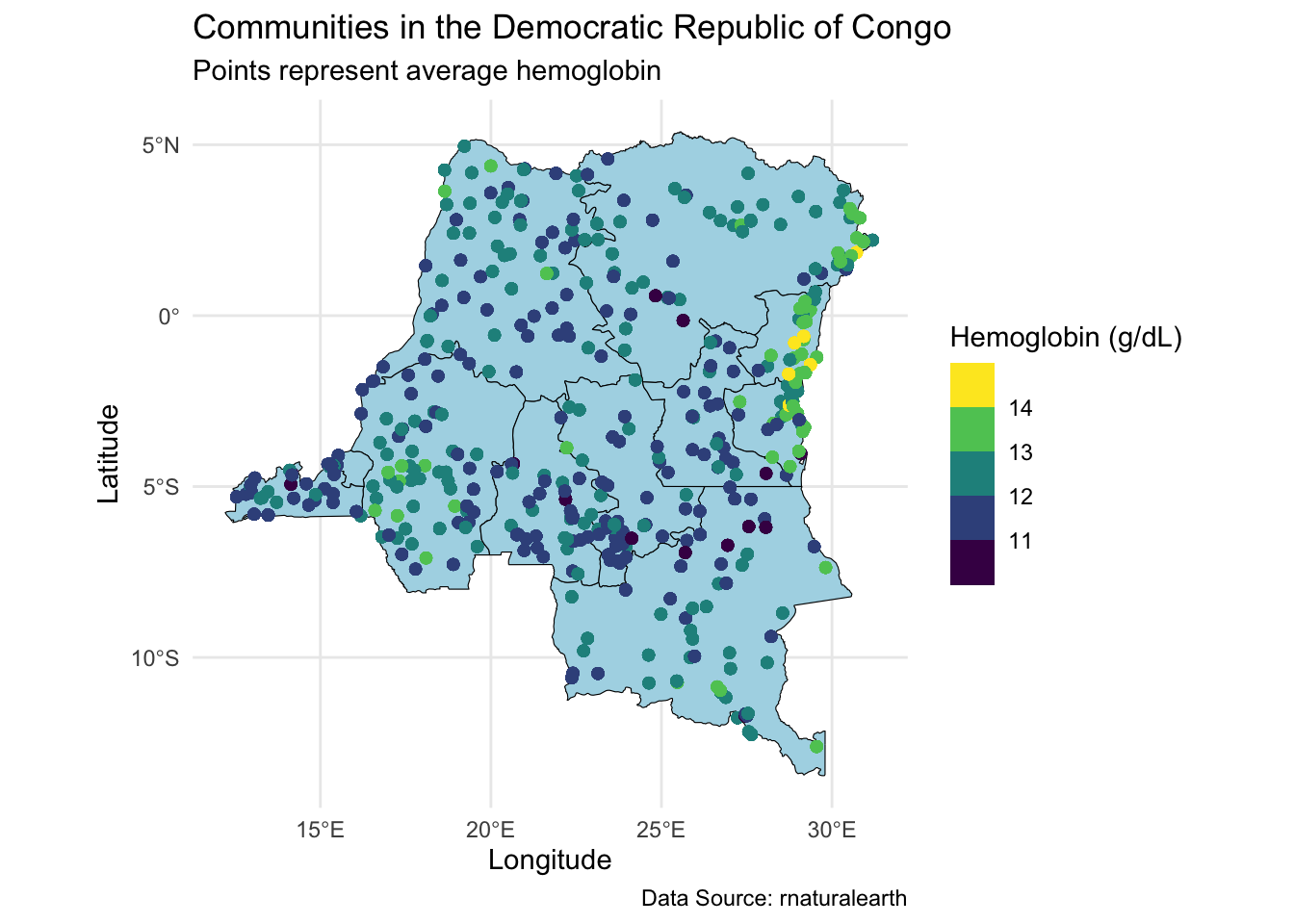
Note the choice of color scale, scale_color_viridis_b. This is a convenient scale for spatial data. An alternative is a continuous scale, scale_color_viridis_c.
Extracting Data for a Subset
In the lecture, we analyzed data from one state as a demonstration. Here we will show the code for accomoplishing this. We start by defining our state of interest. We can see all the states here.
table(data_sf_drc$name) |> kable(col.names = c("State", "Observations"))| State | Observations |
|---|---|
| Bandundu | 1152 |
| Bas-Congo | 447 |
| Équateur | 1175 |
| Kasaï-Occidental | 708 |
| Kasaï-Oriental | 933 |
| Katanga | 980 |
| Kinshasa City | 818 |
| Maniema | 426 |
| Nord-Kivu | 567 |
| Orientale | 897 |
| Sud-Kivu | 490 |
We will work with Sud-Kivu, like we did in the lecture.
state_of_interest <- c("Sud-Kivu")
data_sf_state_of_interest <- data_sf_drc %>% filter(name %in% state_of_interest)
We can then plot the average hemoglobin across our state of interest.
ggplot() +
  # Plot our state of interest
  geom_sf(data = congo_states_map %>% filter(name %in% state_of_interest), fill = "lightblue", color = "black", size = 0.2) +
  # Plot the points from your data
  geom_sf(data = data_sf_state_of_interest, aes(color = mean_hemoglobin), shape = 16, size = 2) +
  scale_color_viridis_b() +
  theme_minimal() +
  labs(title = "Map of Sud-Kivu in the DRC",
       caption = "Data Source: rnaturalearth",
       color = "Hemoglobin (g/dL)") +
  theme(axis.text = element_blank(),
        axis.ticks = element_blank(),
        axis.title = element_blank()) +
  coord_sf()  # Ensures the map is properly projected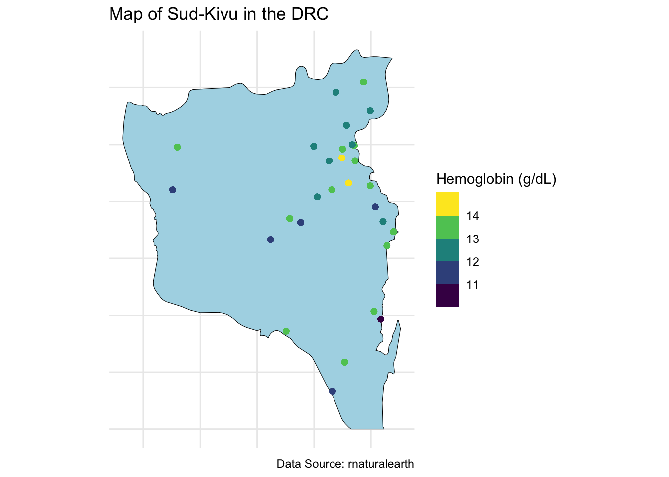
Obtain a Grid for Prediction
To obtain a grid for prediction, we need to obtain the boundary box for the spatial object.
bbox <- st_bbox(congo_states_map %>% filter(name %in% state_of_interest))
bbox
xmin ymin xmax ymax
26.821237 -4.999953 29.259357 -1.666668 We then specify a \(20 \times 20\) grid across the boundaries of the state.
n_lat <- 20
n_long <- 20
latitudes <- seq(bbox["ymin"], bbox["ymax"], length.out = n_lat)
longitudes <- seq(bbox["xmin"], bbox["xmax"], length.out = n_long)
Create a data frame with all combinations of latitudes and longitudes and convert to an sf data object.
grid_points <- expand.grid(lat = latitudes, long = longitudes)
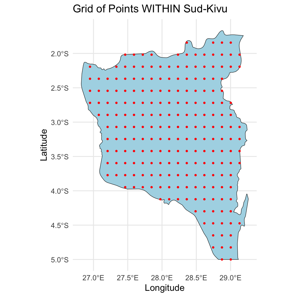
grid_sf <- st_as_sf(grid_points, coords = c("long", "lat"), crs = 4326)We will then make sure to only keep points within the Sid-Kivu boundary using st_within (points must be within the polygon).
grid_inside_drc <- grid_sf[st_within(grid_sf, congo_states_map %>% filter(name %in% state_of_interest), sparse = FALSE), ]Finally, we can plot the grid points within the state, both the original grid and the points within the state.
# Plot the whole grid
ggplot() +
  geom_sf(data = congo_states_map %>% filter(name %in% state_of_interest), fill = "lightblue", color = "black") +
  geom_sf(data = grid_sf, color = "red", shape = 16, size = 1) +
  theme_minimal() +
  labs(title = "Grid of Points across Sud-Kivu",
       x = "Longitude", y = "Latitude")
# Plot the grid points within the states
ggplot() +
  geom_sf(data = congo_states_map %>% filter(name %in% state_of_interest), fill = "lightblue", color = "black") +
  geom_sf(data = grid_inside_drc, color = "red", shape = 16, size = 1) +
  theme_minimal() +
  labs(title = "Grid of Points WITHIN Sud-Kivu",
       x = "Longitude", y = "Latitude")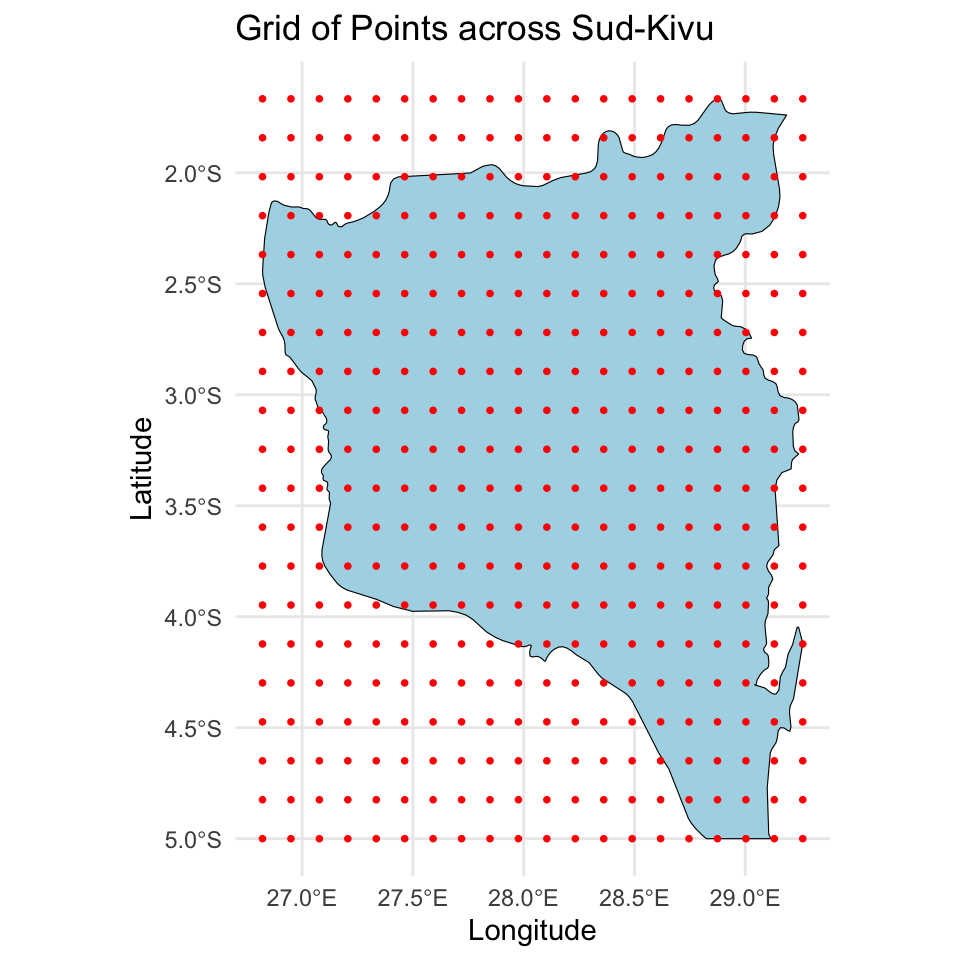
Fit a Bayesian Spatial Model
We will fit the model introduced in the lecture. We begin by preparing the data for the Stan model. We start by defining the vector \(\mathbf{Y}\) and the matrix \(\mathbf{X}\), being careful to not include an intercept. We then define the location identifier. We also define \(N = \sum_{i=1}^{n} n_i\), the number of spatial locations, \(n\), and the number of predictors, \(p\).
Y <- data_sf_state_of_interest$hemoglobin
X <- model.matrix(~ I(age / 10) + as.factor(urban), data = data_sf_state_of_interest)[, -1]
Ids <- as.numeric(as.factor(data_sf_state_of_interest$loc_id))
N <- length(Y)
p <- ncol(X)
n <- length(unique(Ids))
We then define both the observed coordinates, \(\mathbf{u}\), and the new coordinates where predictions are desired, \(\mathbf{u}^*\). Note that \(\mathbf{u}\) should be \(n\) dimensional, meaning it only includes the \(n\) unique locations, not all \(N\) locations. We also define \(d\) the dimension of the spatial location vector (i.e., \(d=2\)), and \(q\), the number of new spatial locations.
u <- st_coordinates(data_sf_state_of_interest)[!duplicated(data_sf_state_of_interest$loc_id), ]
u_new <- st_coordinates(grid_inside_drc)
d <- ncol(u)
q <- nrow(u_new)
Finally, we define the matrix \(\mathbf{X}^*\), which is an \(q \times p\) dimensional matrix that contains the predictor values for each of the new locations. We just specify the overall average mean age and specify everyone to be rural.
X_new <- matrix(cbind(mean(data_sf_state_of_interest$age), 0), nrow = q, ncol = p, byrow = TRUE)We can now define the Stan data object.
stan_data <- list(
  N = N,
  p = p,
  n = n,
  d = d,
  q = q,
  Y = Y,
  X = X,
  Ids = Ids,
  u = u,
  u_new = u_new,
  X_new = X_new
)
We can then compile and fit the spatial model, which is saved in geospatial.stan, and is available in your AE 07 repo. I specify a few additional arguments to run the model for more iterations and don’t save a few parameters that are not needed for inference. I also played with control to get optimal convergence. For this model it is useful to specify options(mc.cores = 4).
options(mc.cores = 4)
geospatial_model <- stan_model(file = "geospatial.stan")
fit_spatial <- sampling(geospatial_model, stan_data,
iter = 4000,
control = list("adapt_delta" = 0.99),
pars = c("z", "LK", "theta_new", "lp__"),
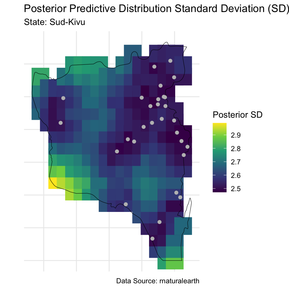
include = FALSE)We can do all of the typical evaluation of MCMC convergence, posterior predictive checks, and posterior summaries. Here I will show you the code for mapping the posterior predictive distribution across the predictive grid. We begin by extracting the posterior predictive distribution for our grid and then compute posterior mean and standard deviation.
Y_new <- rstan::extract(fit_spatial, pars = "Y_new")$Y_new
means <- apply(Y_new, 2, mean)
sds <- apply(Y_new, 2, sd)
We then add these predictions to the sf spatial grid object.
grid_inside_drc$prediction_mean <- means
grid_inside_drc$prediction_sd <- sds
We are now ready to create the visualizations.
# Means
ggplot() +
  geom_sf(data = grid_inside_drc, aes(color = prediction_mean), shape = 15, size = 10) +
  scale_color_viridis_c() +
  geom_sf(data = congo_states_map %>% filter(name %in% state_of_interest), fill = NA, color = "black", size = 1) +
  geom_sf(data = data_sf_state_of_interest[!duplicated(data_sf_state_of_interest$loc_id), ], col = "gray", shape = 16, size = 2) +
  theme_minimal() +
  labs(title = "Posterior Predictive Distribution Mean",
       subtitle = paste("State:", paste(state_of_interest, collapse = ", ")),
       caption = "Data Source: rnaturalearth",
       color = "Posterior Mean") +
  theme(axis.text = element_blank(),
        axis.ticks = element_blank(),
        axis.title = element_blank()) +
  coord_sf()  # Ensures the map is properly projected
# Standard deviations
ggplot() +
  # Plot the points from your data
  geom_sf(data = grid_inside_drc, aes(color = prediction_sd), shape = 15, size = 10) +
  scale_color_viridis_c() +
  geom_sf(data = congo_states_map %>% filter(name %in% state_of_interest), fill = NA, color = "black", size = 1) +
  geom_sf(data = data_sf_state_of_interest[!duplicated(data_sf_state_of_interest$loc_id), ], col = "gray", shape = 16, size = 2) +
  theme_minimal() +
  labs(title = "Posterior Predictive Distribution Standard Deviation (SD)",
       subtitle = paste("State:", paste(state_of_interest, collapse = ", ")),
       caption = "Data Source: rnaturalearth",
       color = "Posterior SD") +
  theme(axis.text = element_blank(),
        axis.ticks = element_blank(),
        axis.title = element_blank()) +
  coord_sf()  # Ensures the map is properly projected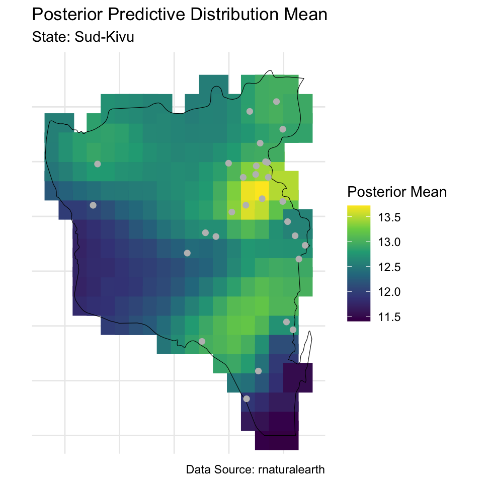
Visualizing the Correlation
Finally, we will visualize the posterior correlation function. We begin by extracting the posterior mean value of the covariance function tuning parameter.
rho_mean <- mean(rstan::extract(fit_spatial, pars = "rho")$rho)We can then define the Matérn 3/2 covariance function, which is a function of the distance between two points, \(||\mathbf{h}||\), and \(\rho\).
matern_3_2 <- function(h, rho) (1 + sqrt(3) * h / rho) * exp(- sqrt(3) * h / rho)We can use this function to compute the correlation matrix for our observed locations. We begin by computing the distance matrix and then compute the correlation matrix at the posterior mean of \(\rho\). We only compute correlation at the unique distances.
D <- as.matrix(dist(u))
dists <- data.frame(distance_geodisic = unique(D[D != 0]))
dists$correlation <- matern_3_2(dists$distance_geodisic, rho = rho_mean)
Next we will use the geodist package to convert the geodisic distance of our observed locations to miles. Note that this function converts distance to meters by default, so we divide by 1,609 to get miles.
dist_miles <- geodist::geodist_vec(
  x1 = u[, 1],
  y1 = u[, 2],
  paired = TRUE,
  measure = "haversine"
) / 1609
This produces an \(n \times n\) matrix of distances. We extract the unique distances like we did for the original geodisic distances.
dists$distances_miles <- unique(dist_miles[dist_miles != 0])Finally, we can plot these correlations for both distance units.
colnames(dists) <- c("Geodisic", "Correlation", "Mile")
dat_fig <- pivot_longer(dists, cols = c("Geodisic", "Mile"), names_to = "Distance")
ggplot(dat_fig, aes(x = value, y = Correlation)) +
  geom_line() +
  facet_grid(. ~ Distance, scales = "free_x") +
  labs(x = "Distance")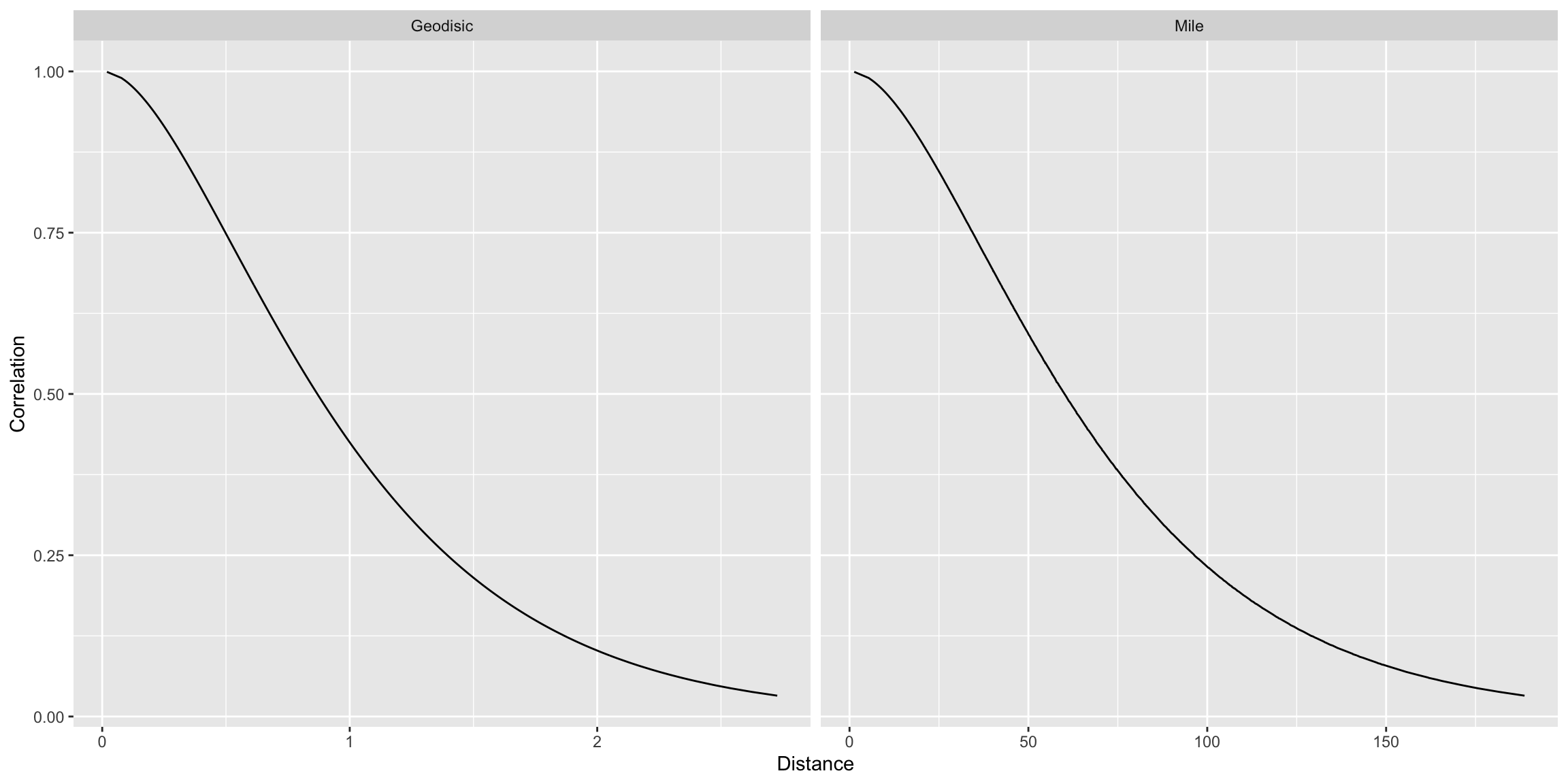
Exercise
Replicate the analysis above for the Orientale state. Visualize the posterior predictive distribution mean and standard deviation across a grid and compare it to the one from Sud-Kivu.
Answer:
# add code here
Important
To submit the AE:
- Render the document to produce the PDF with all of your work from today’s class.
- Push all your work to your AE repo on GitHub. You’re done! 🎉